ShopDreamUp AI ArtDreamUp

Deviation Actions


Description
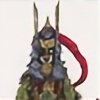
I can assure you that he is pretty good with his Hero business! I'm Pretty sure he has saves at least 2 and 1/2 ladies and has fought at for his life many times! and and you know! done some hero like stuff! 
Image size
1080x1920px 703.67 KB
© 2017 - 2024 MoonlightHawk
Comments27
Join the community to add your comment. Already a deviant? Log In

Hello! Nice character! I like the sketchy lines too, it's a comic strip type of style ...It make the character have more character
Ok so the few things I thought you could improve on or that are not designed as well as they could be:
Not sure what is going on with his nose...it looks hollow like a halloween pumpkin? This might be a style thing, but just so you know it kind of reads as a hole instead of something coming OUT of the face..
The grass at his feet is very different in style - you can have it not be outlined because this sets it apart from the rest which is good- so great job on that - but I think the saturation is still the same as the character which takes away your attention from the character. To fix this, just make it lighter or fade it back (you can just lower the opacity or fill in photoshop)
The hand that is holding the shield should actually be showing a little more considering where the shield is compared to his shoulder/arm...otherwise it looks like his arm is really short. An other way to fix this if you don't want the hand showing more, is to move the shield over so that more of his arm could fit behind it.
The belt and sheath of the sword and little pouch has less shading/highlights than the rest of the drawing - it's good to be consistent
Ok I hope this helps you out! Great job!